Pleth is one of northeast Arkansas’s longest standing full-service marketing agencies. Aside from its award-winning work, the company is known for its vibrant brand materials, featuring bright colors, robust patterns, and overall friendly and approachable design aesthetic. Over 11 years in business, their branding has been relatively consistent — white and grays accented with brighter colors.
Any business that wants to remain competitive will eventually undergo a rebrand. When Pleth decided to leave behind aging brand assets, and to realign its image with its values, we scheduled our kick-off meeting for the next day. My role, as one of three designers on the team, was to help lead the process along and to generate data-backed ideas to Pleth’s owners for consideration.
Challenges
There wasn’t a single problem that sparked Pleth’s rebranding process, but several annoyances: high employee turnover, lack of awareness of Pleth’s changing skill sets, dated branding materials, inconsistent product pricing, and so on. We felt that most of these issues could begin to be remedied if we took a long, thoughtful look at Pleth’s cornerstones.
It would’ve been easy to come up with a new logo and stop there, but the problems we aimed to solve ran deeper than what a aesthetic upgrade would fix. From the beginning, we knew we would change how we operated as a business, how we interacted with clients, who we wanted our clients to be, how we would advertise our services, and more. To start us off, we prepared to dive deep into the core of the business and get our ideas onto paper.
Approach
In the first meeting we discussed what we aimed to accomplish with a rebrand and why we felt we needed it. The second was a SWOT analysis to highlight the real world challenges we would face with a new brand launch and where our strengths and weaknesses lied.
After collecting the data from these two meetings, we agreed that the following were the primary issues we wanted to overcome:
- We wanted to attract substantial, big-name clients.
- We wanted to convey a mature aesthetic.
- We wanted to grow awareness of Pleth's services.
- We wanted to be viewed as experts in our field.
Separately, we developed mood boards with our own ideal aesthetic directions for Pleth. In a third meeting, we presented them to each other and noticed that our ideals all closely matched. It was a positive motivator for everyone to be on the same page from the beginning. From there, we started defining the new brand materials.





Solution
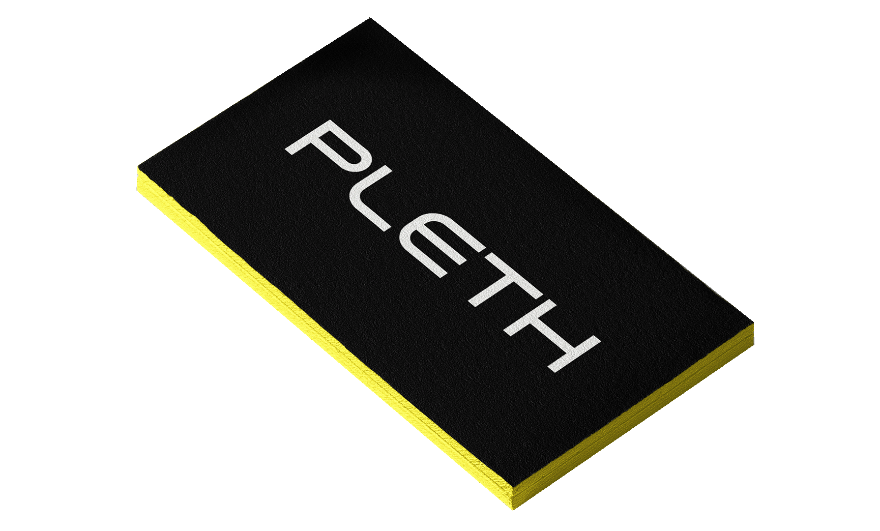
We unanimously decided that changing from orange and white to black and yellow would be the right direction for Pleth. We felt that the palette was more mature and differed from our competitors. Next, we began drafting concepts for a new logo — lots of concepts.
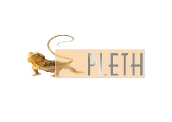
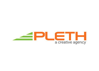
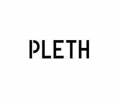
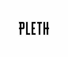
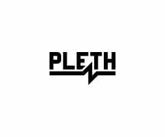
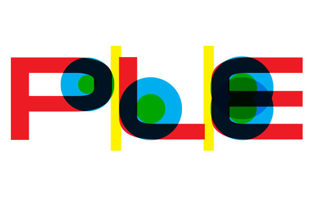
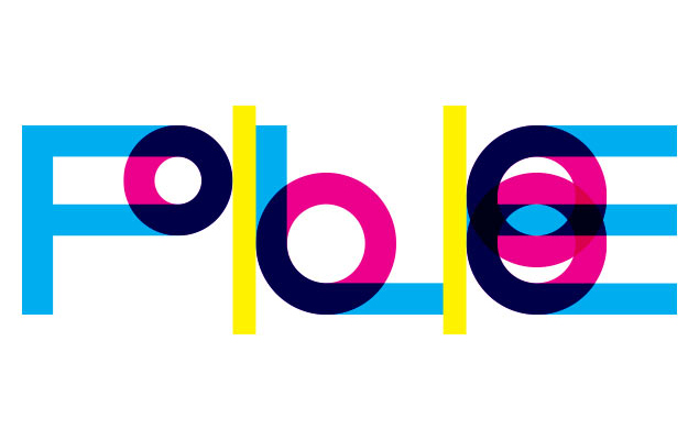
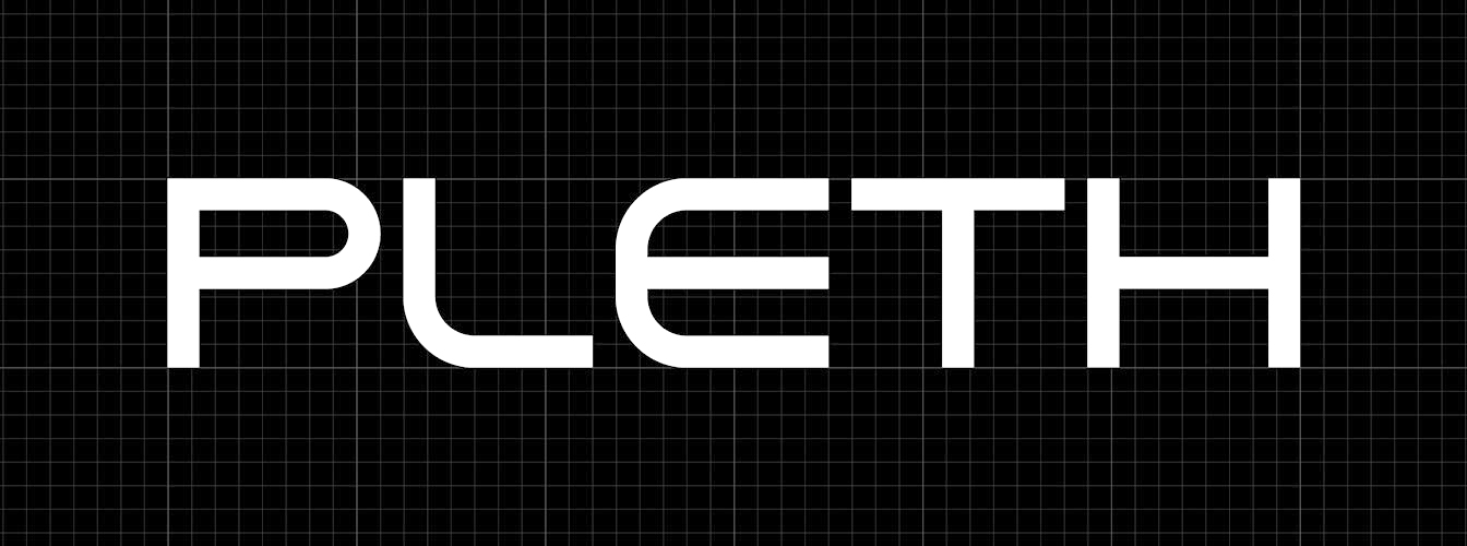
Ultimately, it was decided that refining the existing logo would allow Pleth to maintain brand recognition, avoid confusing clients, and enable us to change other branding elements and motifs to evolve the brand in different ways. The three Adidas-like lines at the end of the logo were removed since they were only decorative (any meaning behind the shapes had been forgotten) and I redrew the letterforms to be mathematically perfected.
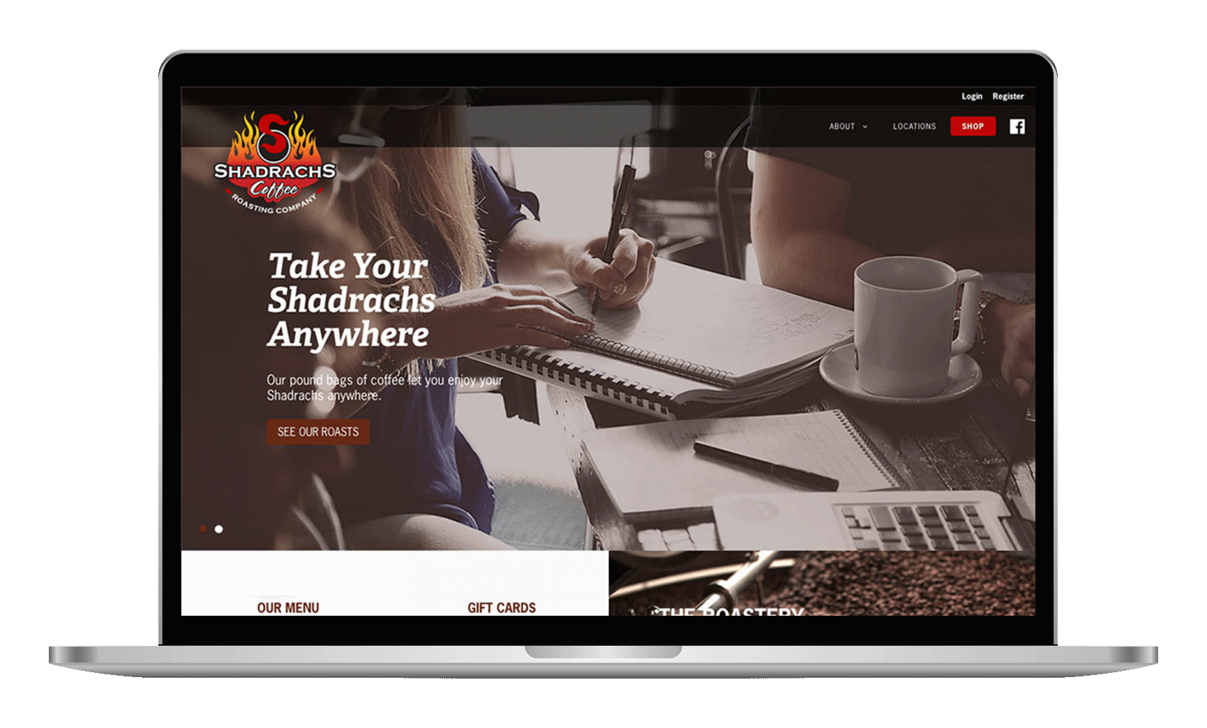
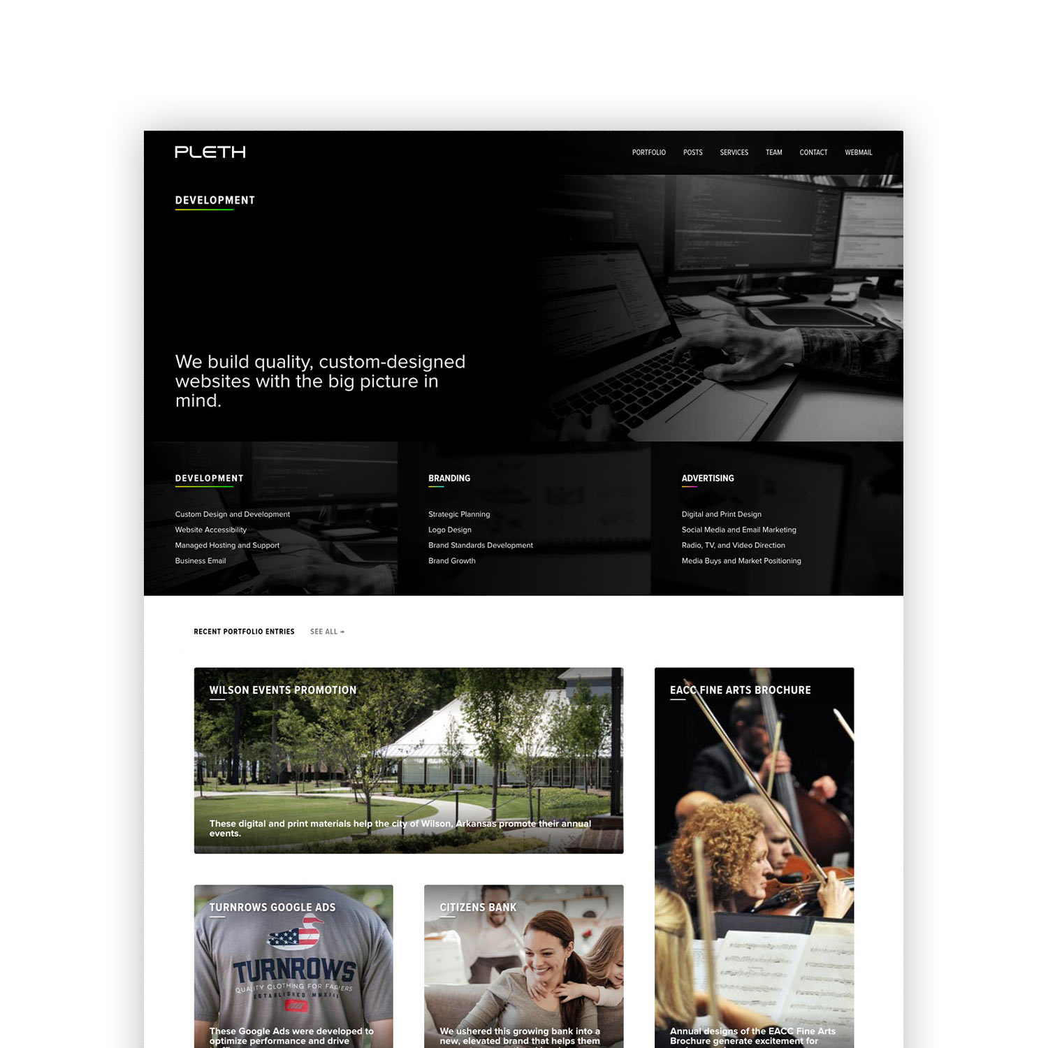
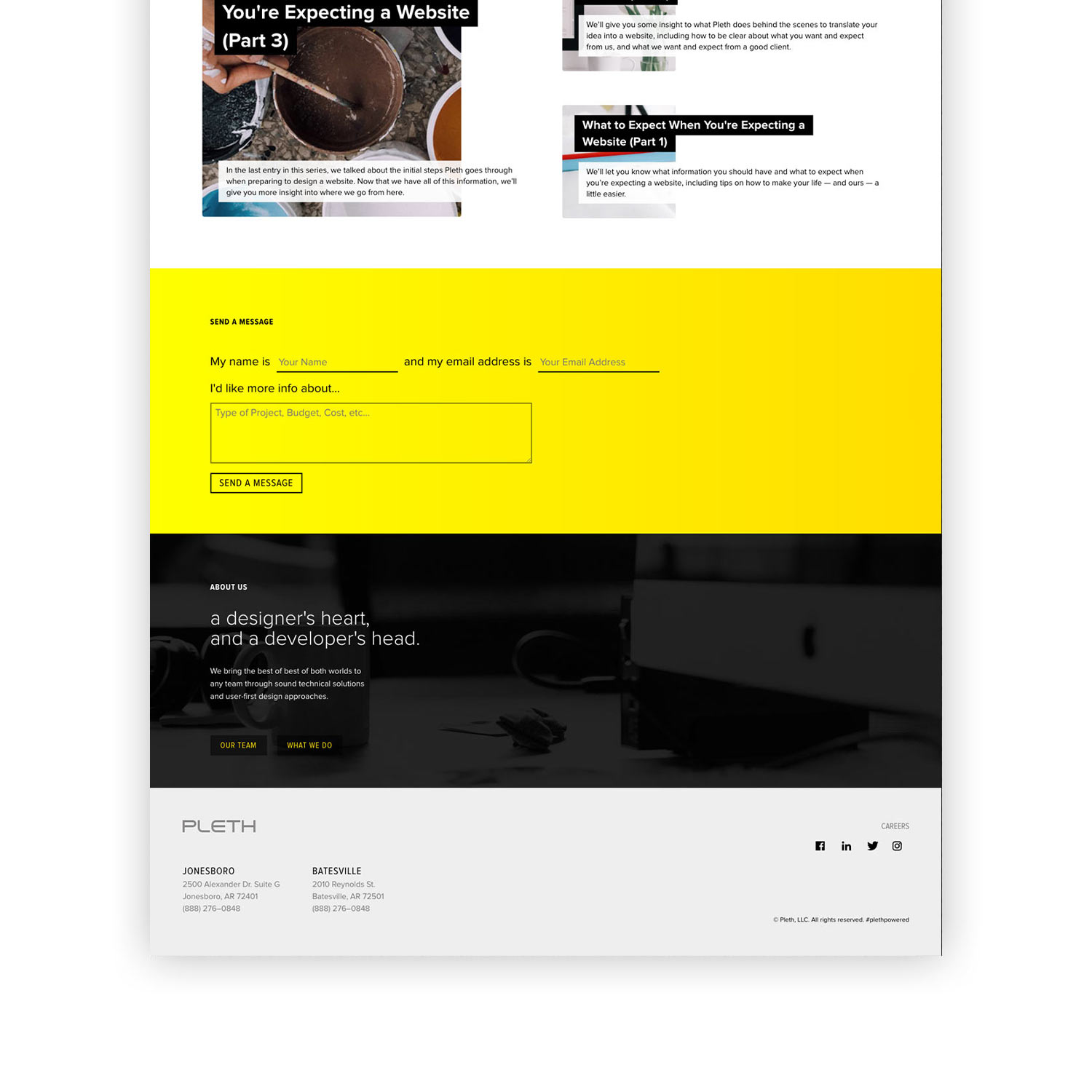
After brand colors and the refined logo, I started developing several types of print materials: business cards, brochures, contract designs, new letterheads, envelopes… anything and everything. I also started drafting ideas for a new Drupal website design with several new features that helped us more easily manage content. The biggest feature I implemented was a modular content system to create art-directed posts on the website with less effort and custom code.
What I Learned
- Consider iteration v. replacement.
Sometimes just improving what you already have is better than expending time on developing something new. - Agreeing on goals makes the process easier.
If you can’t agree on the basics of a project, there will most likely be issues related to those goals down the line. - Rebranding works.
Rebranding improved the morale of everyone involved. We felt good about who we were and how we were presenting ourselves and we got better clients as a result. - Research is necessary.
Having the kick-off meeting and SWOT analysis may seem like a waste to some, but they affected the entire process and set the stage for a positive outcome.
Say Hi! 👋
Feel free to message me with project requests, advice, words of widsom, or just to say hello.
me@wadejewell.com