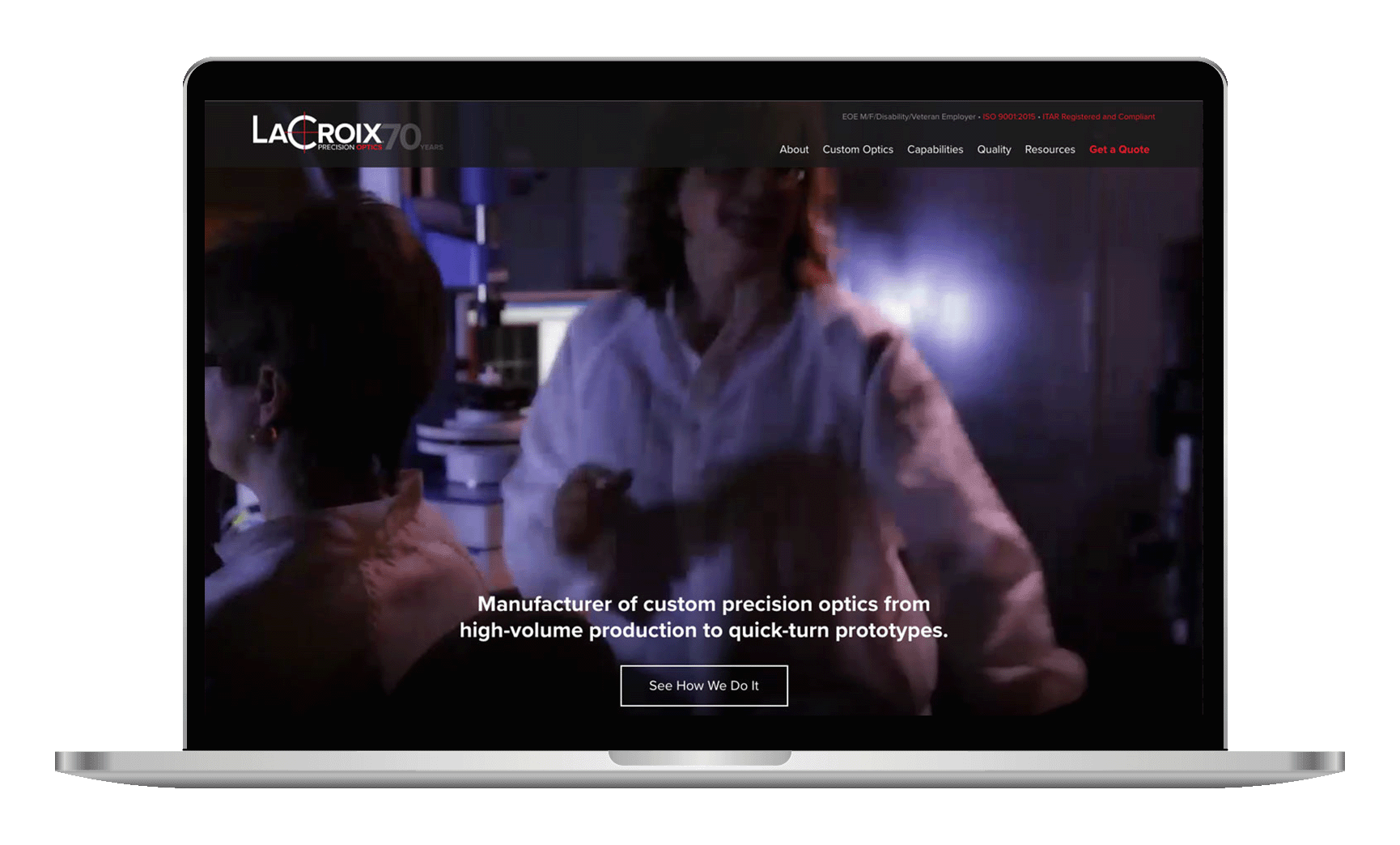
LaCroix Precision Optics is a (you guessed it) precision optics manufacturer located in Batesville, AR. Their products serve vital roles around the world; utilized in medical, defense, scientific, industrial, and astronomy industries.
With products that are so specific and techincal, they requested that their website be upgraded and brought up to date with a more modern design that reflected the quality of their products.
Challenges
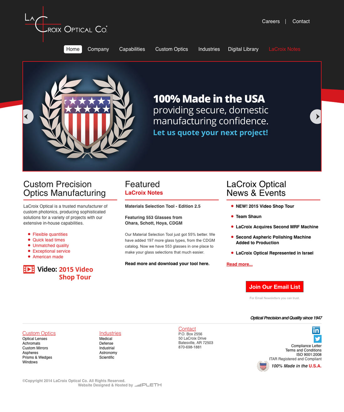
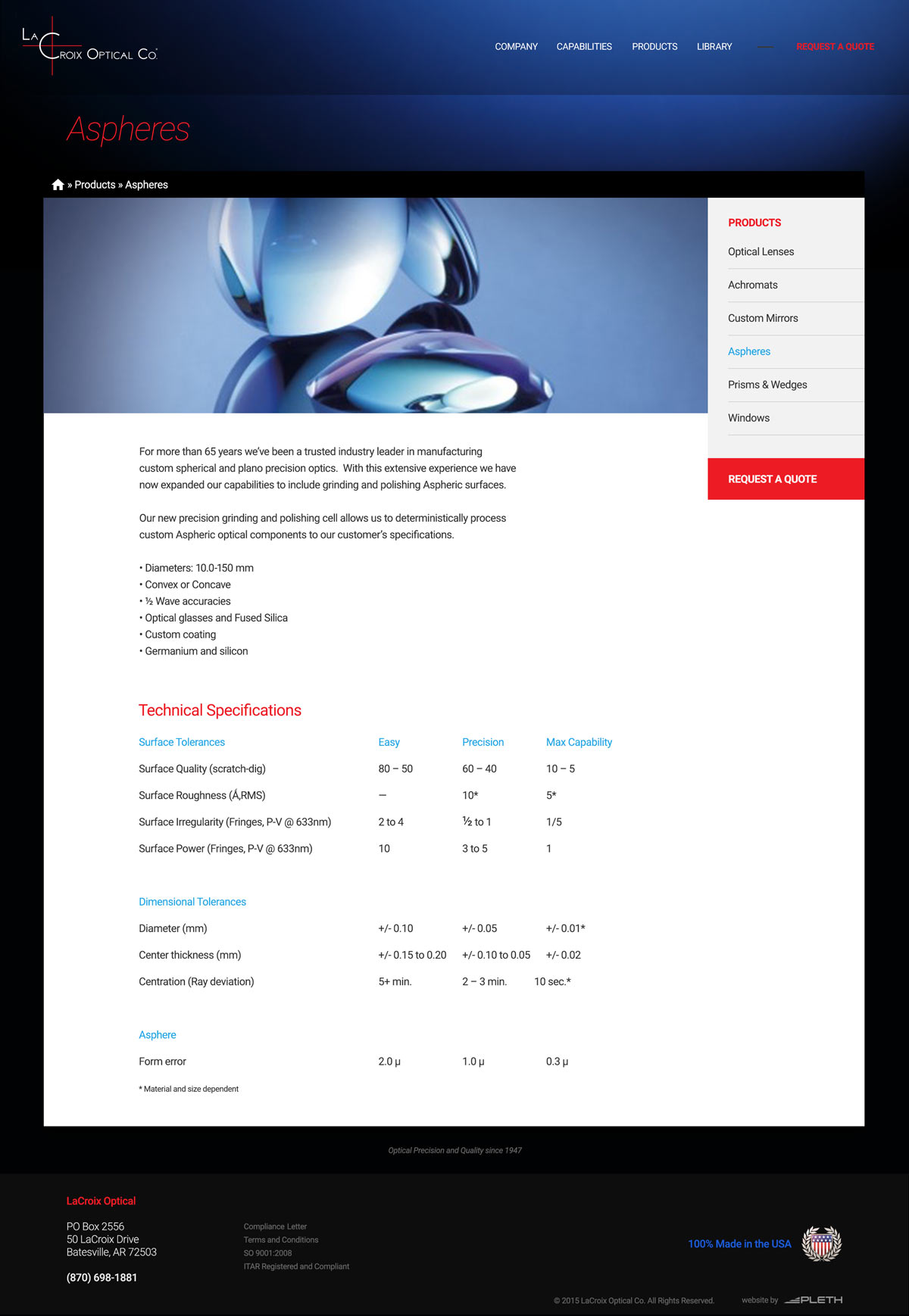
When I began working with Kirk (the VP of LaCroix) on updates, the website was beginning to get stale. There were several parts that were no longer being updated or used, and some of the information wasn't very helpful. After a few meetings, I drafted a few concepts that highlighted the uniqueness of their products.
Approach
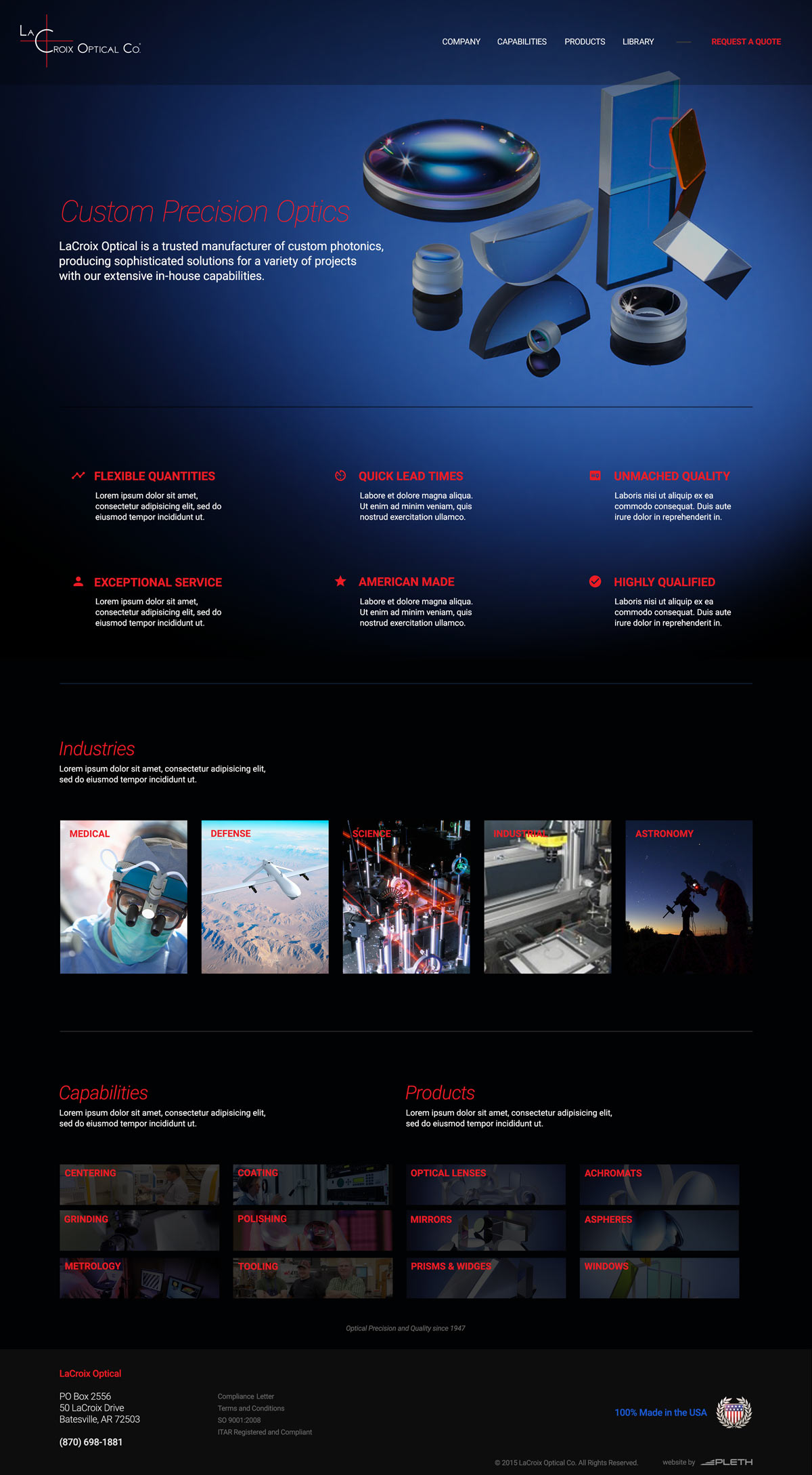
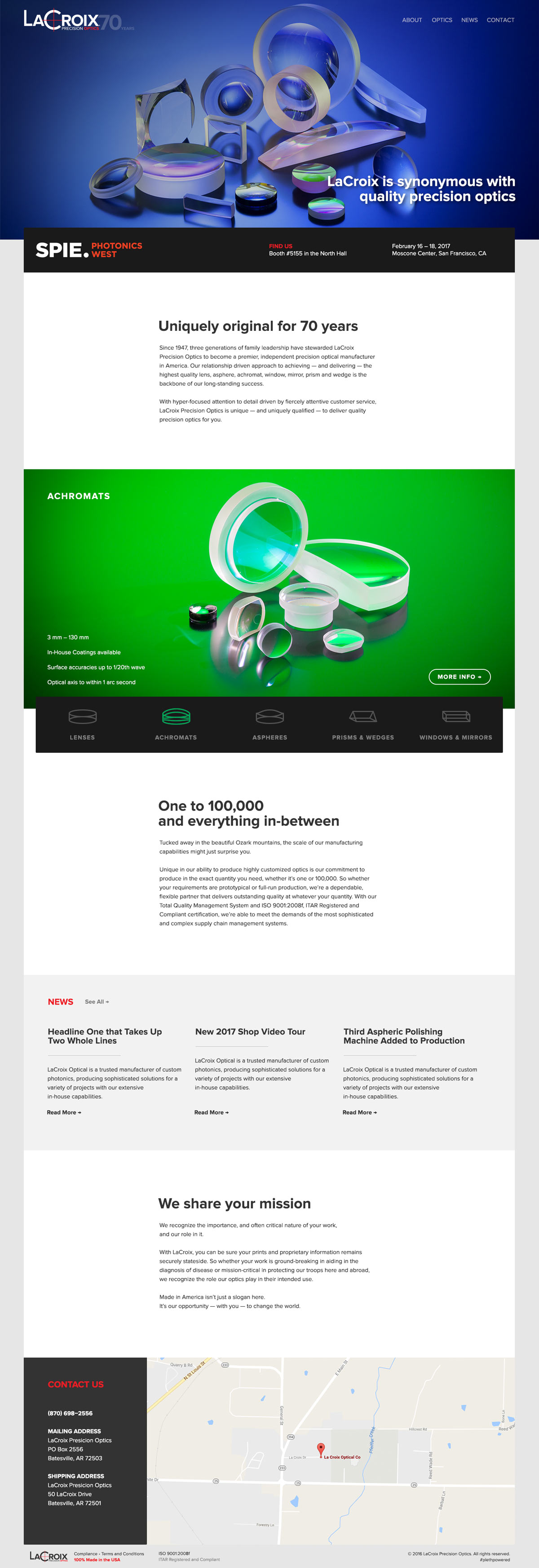
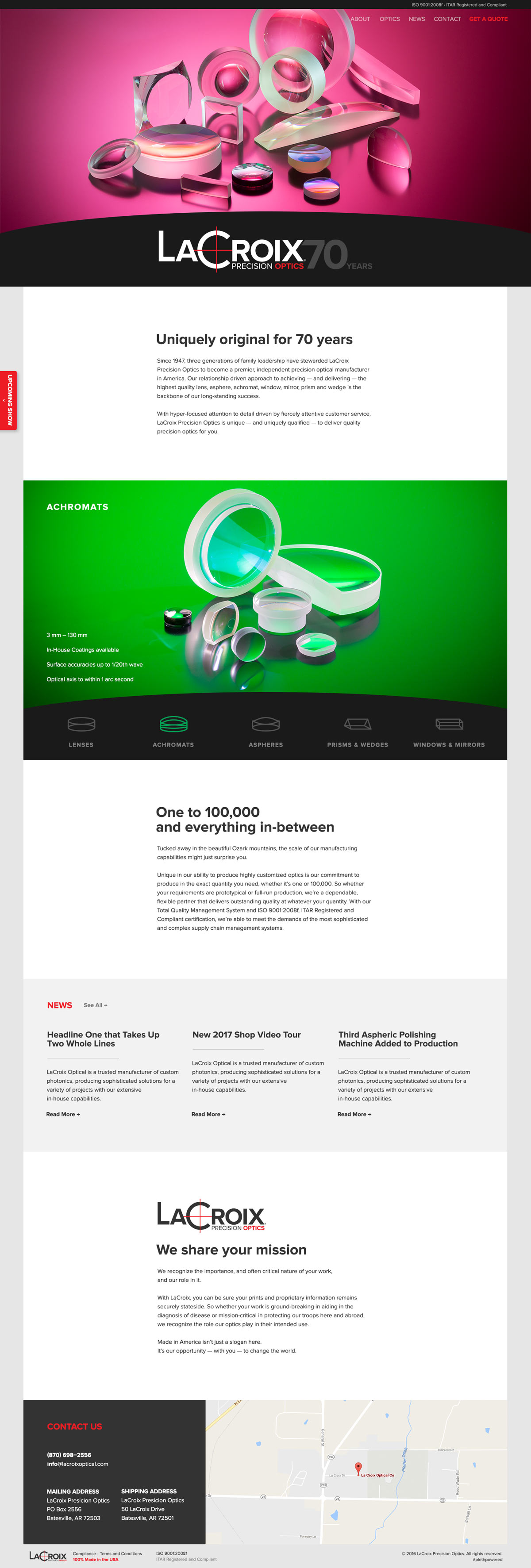
Some time later, Kirk came back to revisit the website updated, but he also brought with him some new branding materials and a new logo. The overarching goal of the redesign was now to update the website with new branding materials and an overall better feel. This led to a new redesign concept.
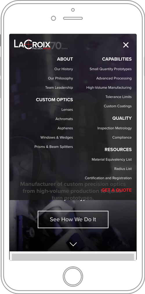
This redesign was loosely based on a brochure that another company had made for them (who led their rebranding and created LaCroix's print work). The influence from the brochure is clear, as some of the design decisions didn't initially translate well, especially the atypical placement of logos.
Solution
The old website was developed with Drupal 7, and the new website was to be upgraded to Drupal 8. Development was generally straightforward, no complicated content types or complex views needed to be created.
The content development process was slow, however. I relied heavily on Kirk for technical information and he wasn't always at-hand deliver the pieces I need, which caused to project to grind. Later, it was decided that some information would be left out at first and added later, after launch.
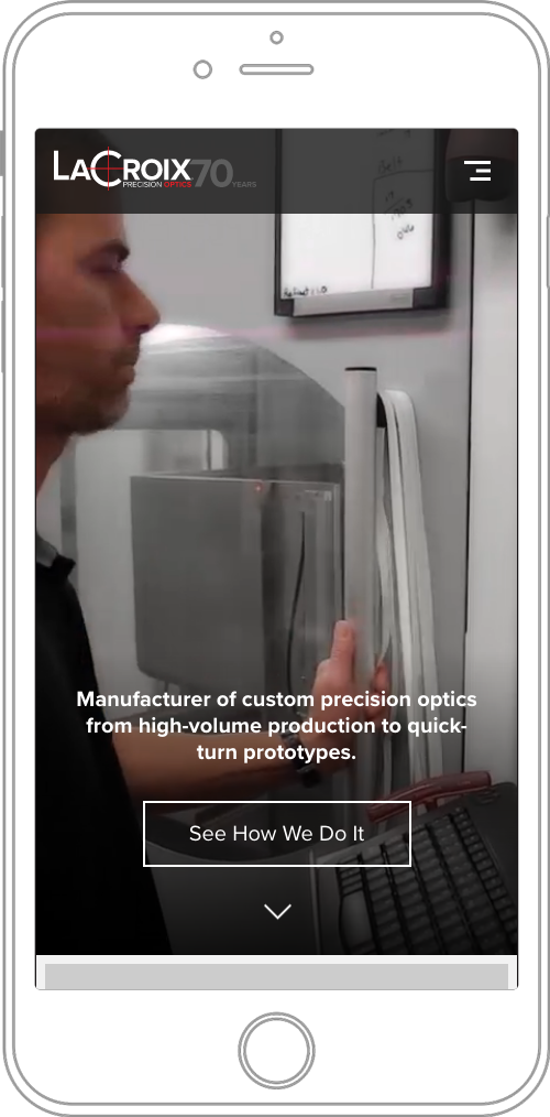
Months later, Kirk wanted to continue with the development by adding more content and iterating on the design again, addressing a few problems that he noticed, especially with regards to content and atypical logo placement.

What I Learned
- Good information makes a good website.
This rule works in reverse too: bad info, bad website. Information architecture is the driving force of all websites. - Quality of visits is more worthwhile then quantity.
In many cases, capturing the attention of the right kind of visitor is better than being broad and vague with regards to a target audience.
Say Hi! 👋
Feel free to message me with project requests, advice, words of widsom, or just to say hello.
me@wadejewell.com